 Chuck Lorenz
On This Page
At a glance
Repository: adapt-listAuthor: Kineo
Type: content presentation component
FW versions: compatible with v2 and above
AT compatible: yes
Fundamentally accessible: yes
RTL support: yes
Purpose
The purpose of List is to present short texts in a visually regular format. In essence, it is a configurable version of a bulleted list. If the standard Text component can accommodate HTML's tags for ordered and unordered lists, why use List? Use List for those times when
- the list is a focal concept
- the list warrants visual prominence
- you want to use an image other than a bullet
- you want to style individual items
- you want to animate the list
Reserve the use of un/ordered tags in Text for those times when a few items appear within paragraphs of expository content.
And think about configuring List horizontally when you are tempted to control content layout with an HMTL table.
How does it work?
The List component doesn't use the HTML list tags, <ul> or <ol>. So it's freed from the confusing CSS required to style the margins and paddings of lists and list items. To retain the accessibility of the semantic tags, List deploys the ARIA roles of list and listitem on the appropriate divs.
"Bullets" are images that you supply. If you don't provide an image, List supplies an over-sized disc as a default.
Each item is a set of image, title, and body. List controls these through the use of CSS Flexbox layout. This means List can offer layout options with minimal changes to code. And you can effect even more layout modifications with minimal custom CSS.
Want motion? Animation is an option. List uses CSS transitions to animate the sequential fly-in of items.
Configuration
Ordered or Unordered
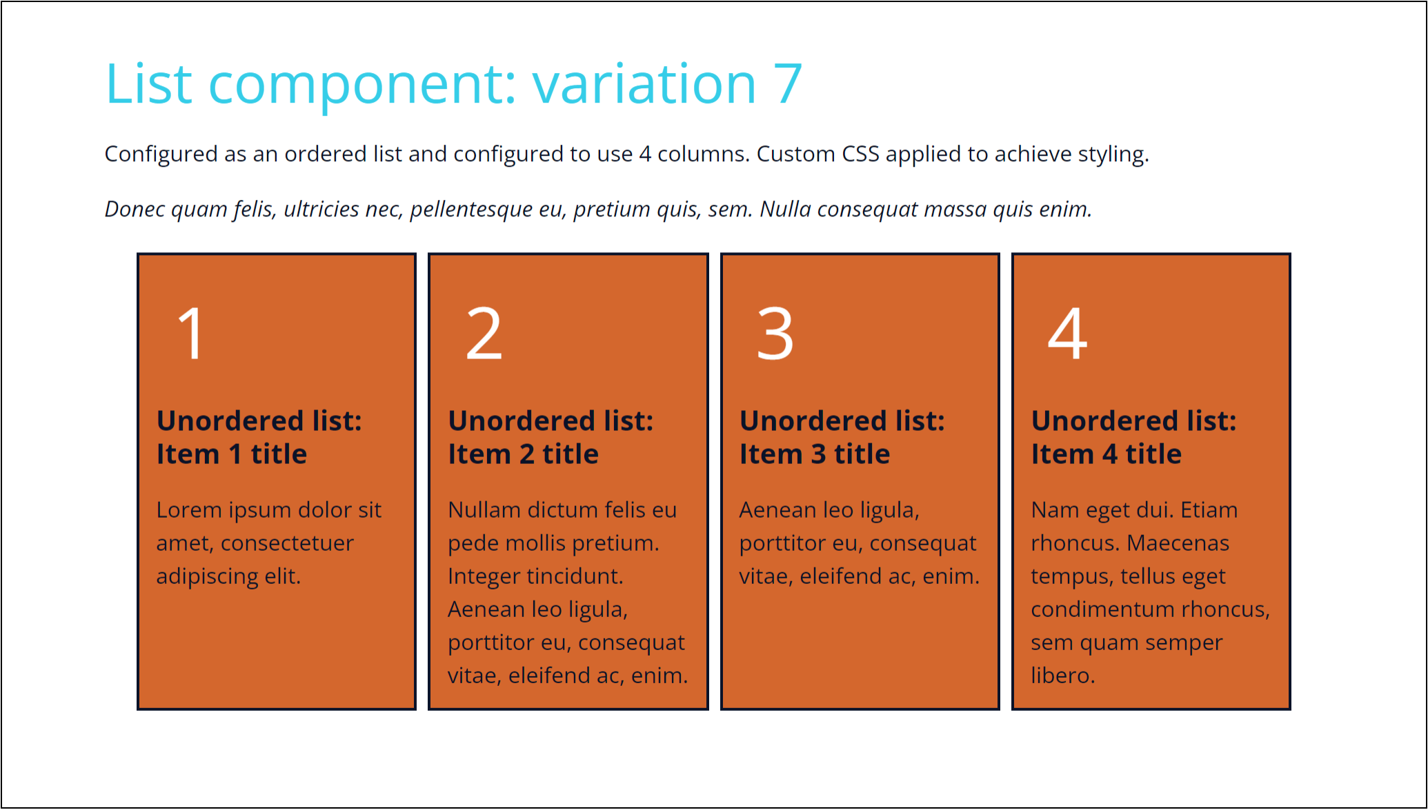
"Ordered" means you want your list items sequentially numbered. "Unordered" means "no numbers."
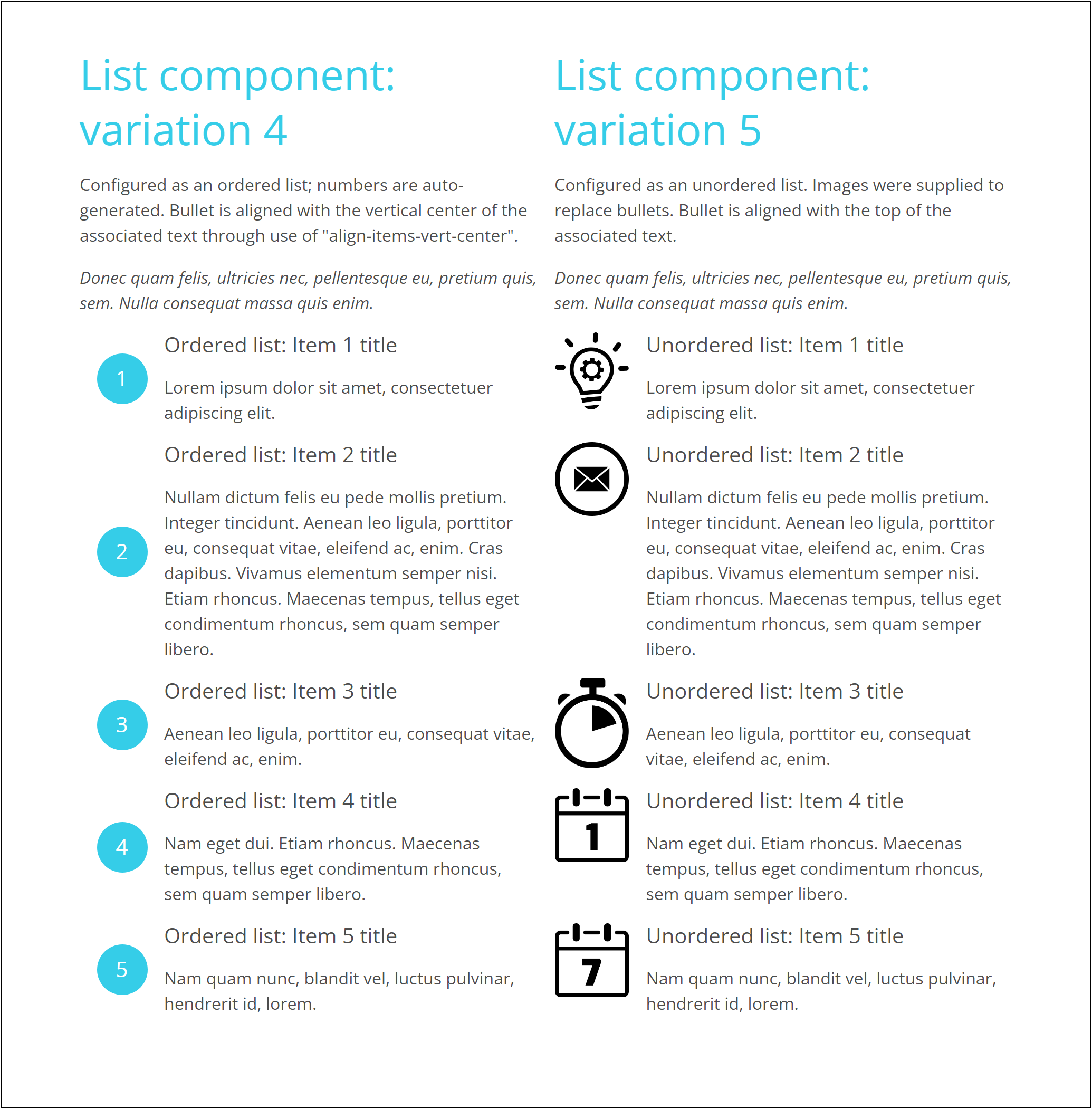
If you choose "ordered", List will give you a disc with a number in it. The number glyph comes from the font-family specified in ".item-title". In Vanilla v5, this is Open Sans.
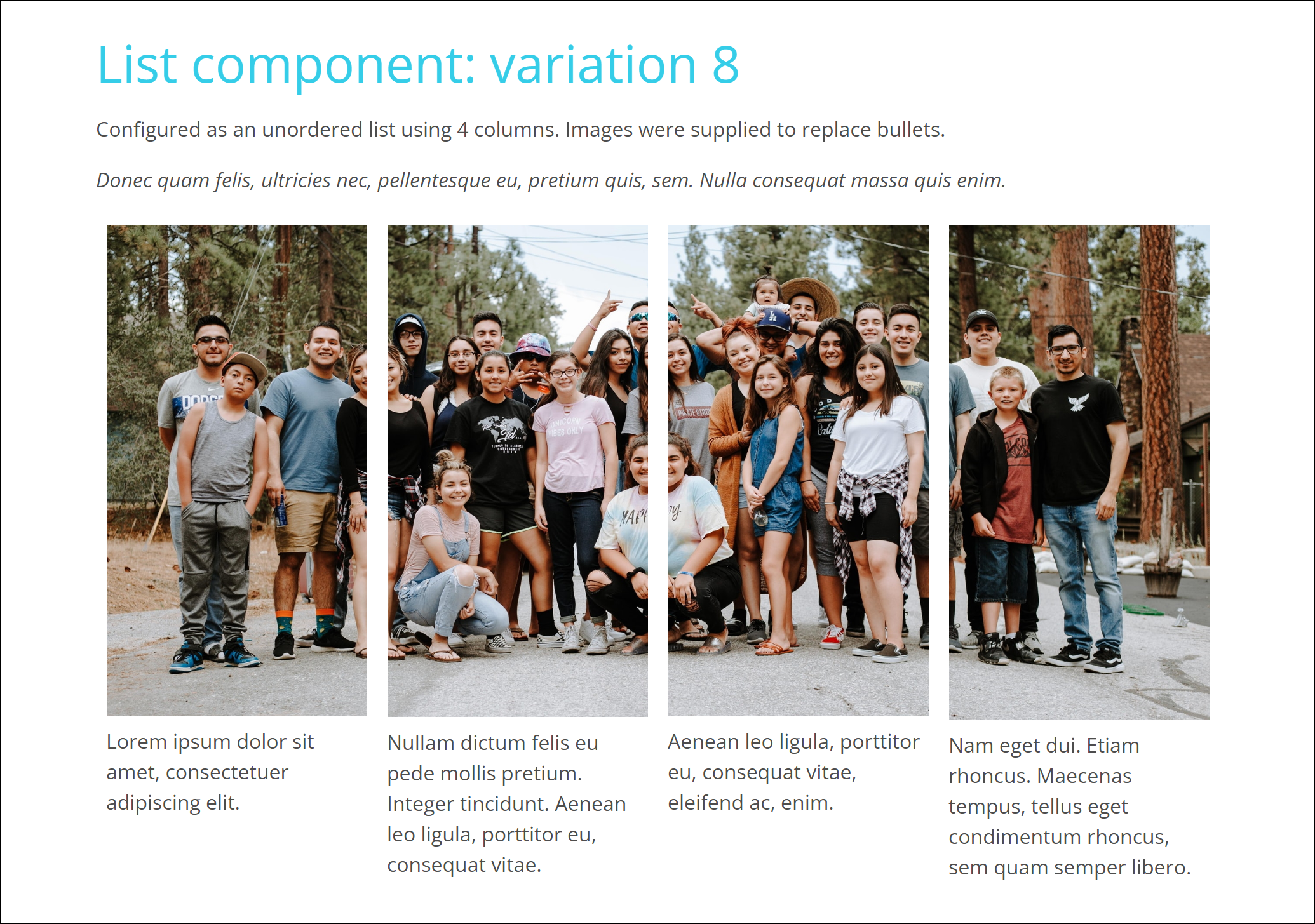
If you don't choose "ordered", you'll get the same default disc but without the number. You'll also have the option of replacing the disc with an image of your choice. The presentation size of the image is controlled by List's CSS: 20% of the item for the image and 80% for the text content. Adjust this, if desired, with custom CSS. Size your images appropriately and optimize them.
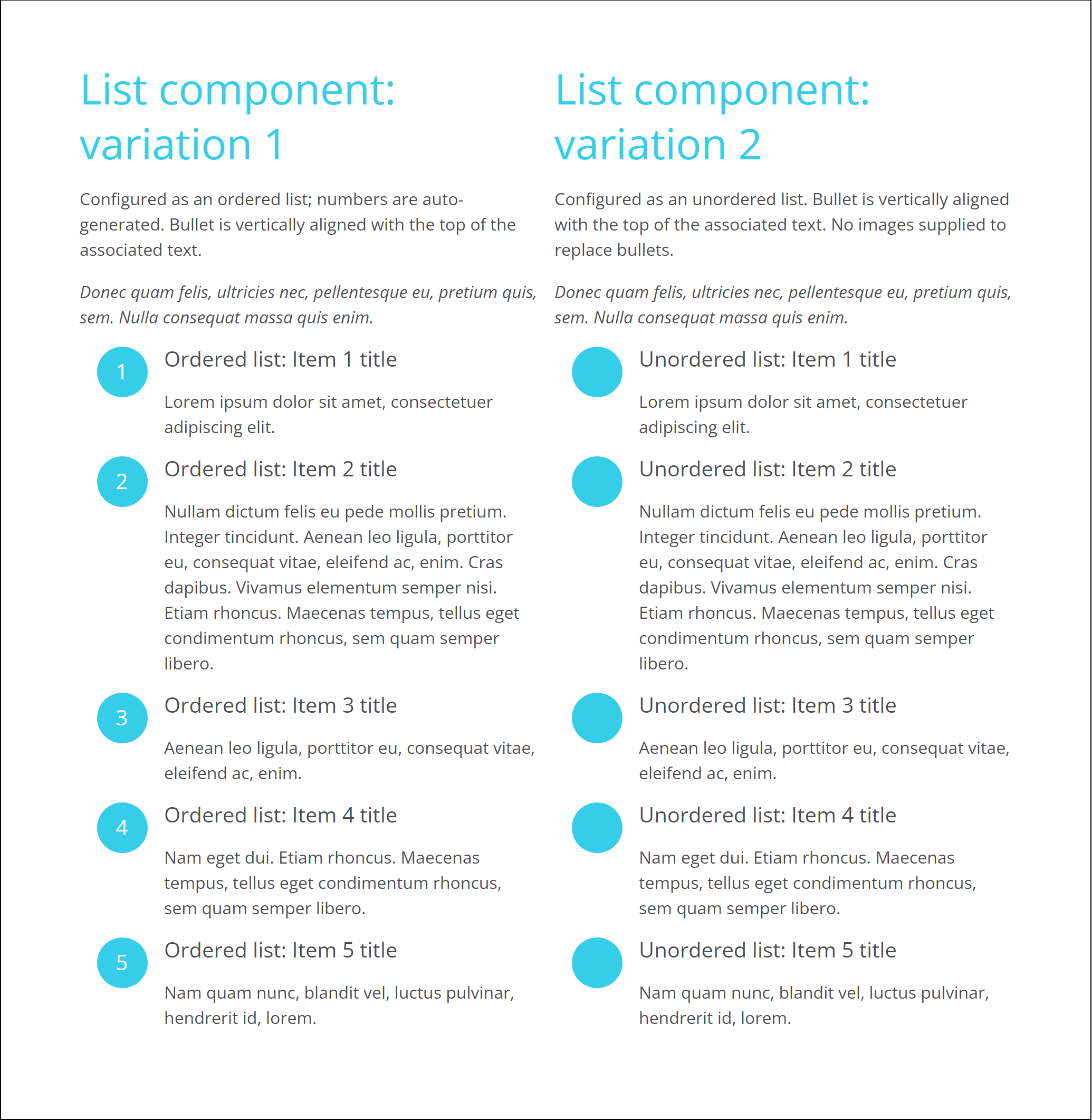
Image alignment
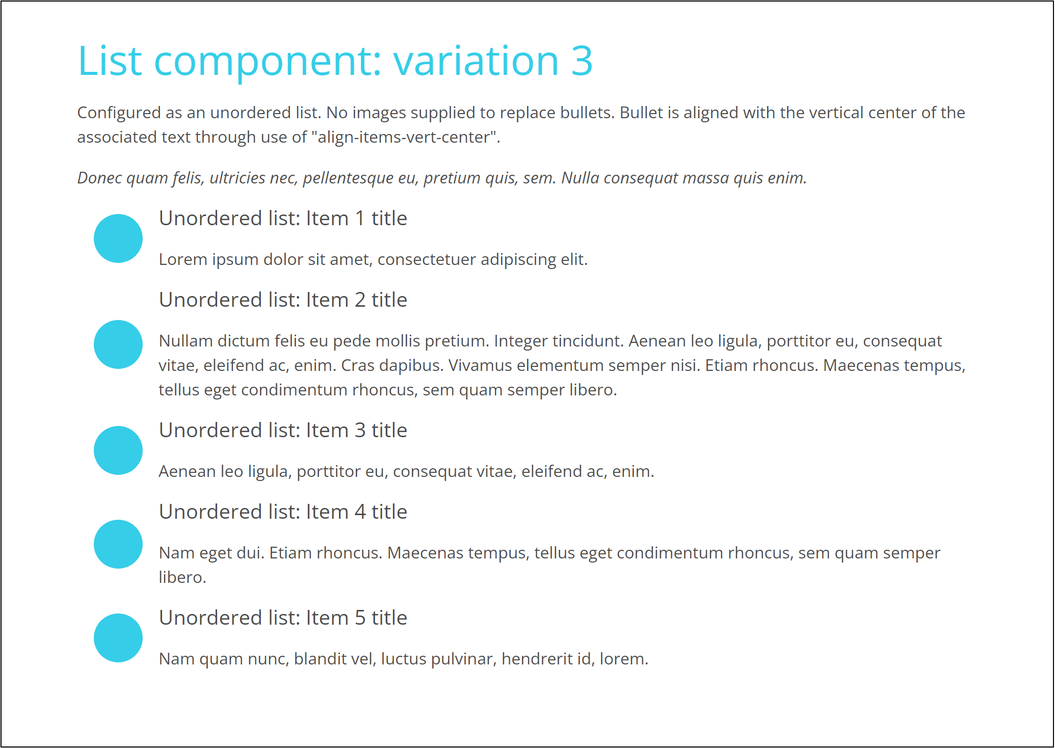
How do you want your bullets/images to align with the text next to it? The default aligns the top of the image with the top of the text. In order to align the image and the text on their vertical centers, add this predefined CSS class to the List: "align-items-vert-center".
Vertical list or horizontal list
We are conditioned to associate a list with vertically stacked items. But there are times when a horizontal presentation makes better visual sense. Consider the case where you have three or four items with short text content. Stacking them vertically can leave so much white space to one side that the presentation feels visually imbalanced. Imagine instead presenting them horizontally in a row. Space that was left to the side is shifted in this case to below the items. And it is naturally filled by the next block of components.
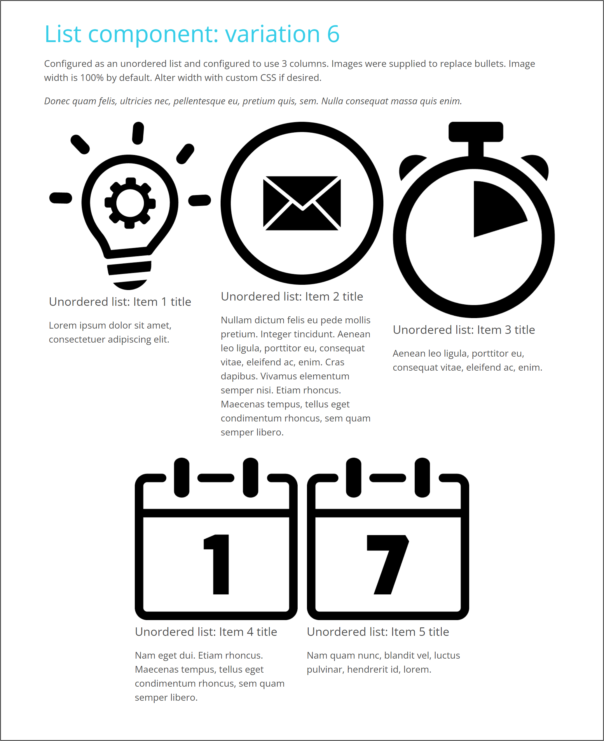
To effect a horizontal presentation, configure the Columns property with the maximum number of items you want to appear in a row.
When items appear in a horizontal layout, the elements of each item are stacked vertically. The width of each item's image matches the width of item/column—it is no longer "20%". If you supply images, expect also to supply custom CSS to control the images' width in desktop, tablet, and mobile phone formats.
The horizontal option is a worthy alternative to HTML tables. Tables are not responsive. The four columns of a table, for example, displayed in a desktop browser will not stack itself into a single column when viewed on a mobile phone. Deft use of List's horizontal option can imitate the rows and columns of a table and can provide stacked content essential to mobile presentations.
Other examples with custom CSS
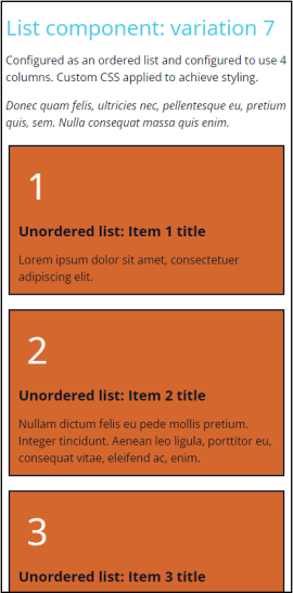
Variation 7 viewed in phone browser
Strengths and weaknesses
Strengths
- It's easy to give visual prominence to a list.
- The horizontal layout provides effective alternatives.
- It's easy to control the styling of each item's image and text.
- Accessibility standards are maintained.
- Authored by a company with a strong reputation.
Weaknesses
- The horizontal layout triggered by the Columns property and the predefined class "align-items-vert-center" are not available in versions compatible with Framework versions 2, 3, and 4.
- There are no out-of-the-box options to vary animation properties.