 Chuck Lorenz
On This Page
Visual button states have a long history on the web. Hover your mouse over a button, and I bet you'll see a color change.
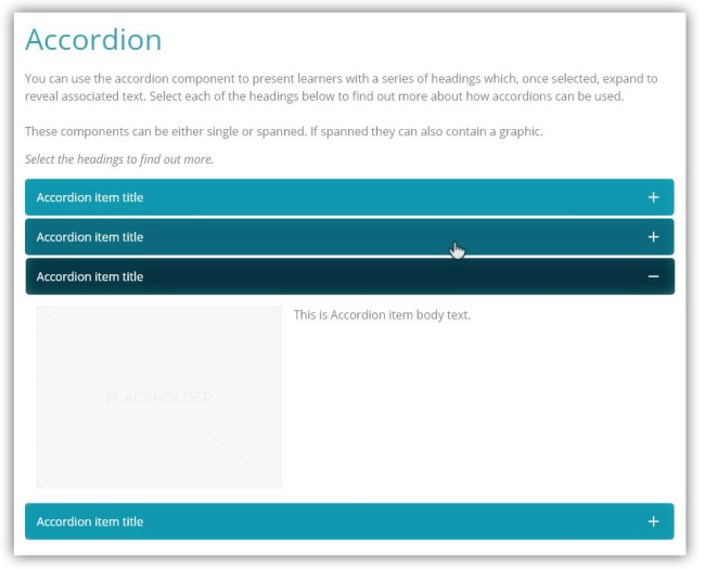
Adapt's Vanilla theme automatically generates colors for buttons and other interactive items such as Accordion's item title bars. It takes your default color and darkens it for the Hover color. It darkens it even more for the color of the Selected state. You don't have to use these generated colors. But your team will save time if the colors are acceptable to your design.
I'm going to show you how you can preview these colors without spinning up an Adapt course. I'll provide instructions upfront, then follow up with some explanations.
You'll need a color converter right away. I'll use the color converter found on W3Schools' website.
Instructions
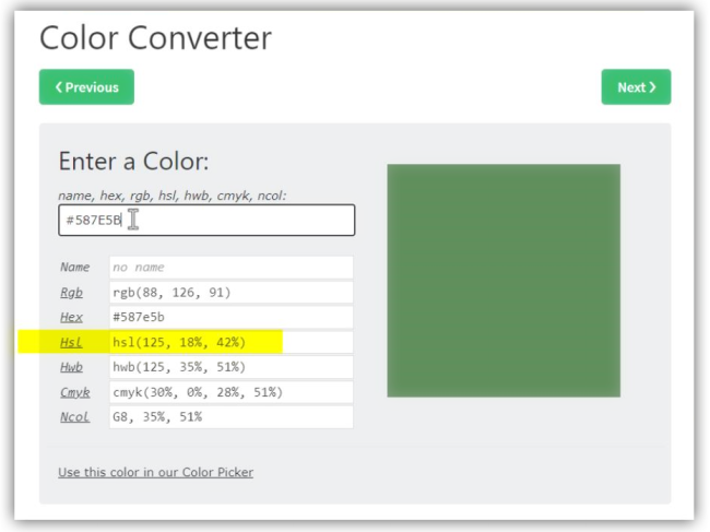
1. Paste the default color code into the converter
It is likely that your colors are spec'd in Hex, but we need to work with HSL. So we start by converting whatever color code you have (e.g. Hex, RGB) into HSL. (HSB is not HSL.)
2. Paste the HSL code into the converter
When you paste the HSL code into the converter, the color that is displayed will not change. We simply swapped color definitions of the same color. We'll change it in the next step.
3. Subtract 10 from the third value in the HSL code
In the example pictured below, the third value was 42%. By subtracting 10, I changed this value to 32%.
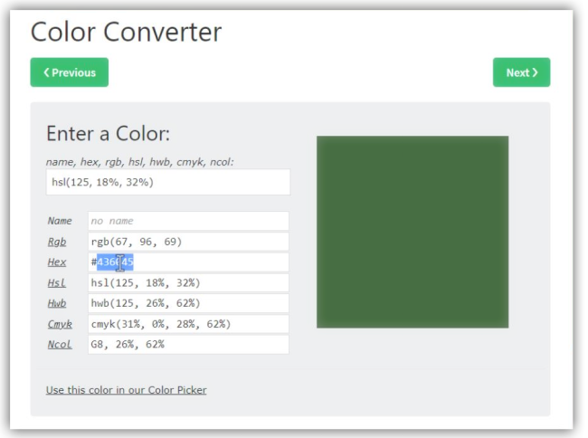
4. Copy the resulting Hex code
The newly generated color is the color that Vanilla would produce for the Hover state. Copy the Hex code (or whatever code your team works with) and paste it into your documentation or design.
Repeat the process
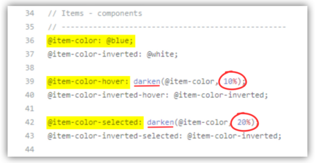
When the Vanilla theme generates the state colors automatically, it creates a Hover color by darkening the default/normal color by 10%--as we did above. When it creates a color for the Selected state, it darkens the default/normal color by 20%. To preview the Selected color, you can repeat the steps; EXCEPT in step 3, subtract 20.
More detail
Vanilla generates these colors with a Less function.
This function manipulates the color's definition in the HSL color space. Converting Hex or RGB to HSL doesn't change the color; it provides a different definition of the same color. The HSL definition allows us to easily darken and lighten colors.
The letters in HSL stand for hue, saturation, and lightness. And they correspond to the three values you find in every HSL color code. When we change the third value in a code, we are manipulating lightness. 0% lightness is associated with black, and 100% lightness is associated with white.
- When you want to move a color toward black (to darken it),
subtract an increment. - When you want to move a color toward white (to lighten it),
add an increment.
Vanilla is "hard-wired" to create these state colors by darkening the default by 10% and 20%. You are not restricted to increments of 10. You can also lighten a color rather than darken it. But you may need some assistance depending on your coding skills. A developer can make a code modification to both the increment and the direction of the function (darken or lighten).
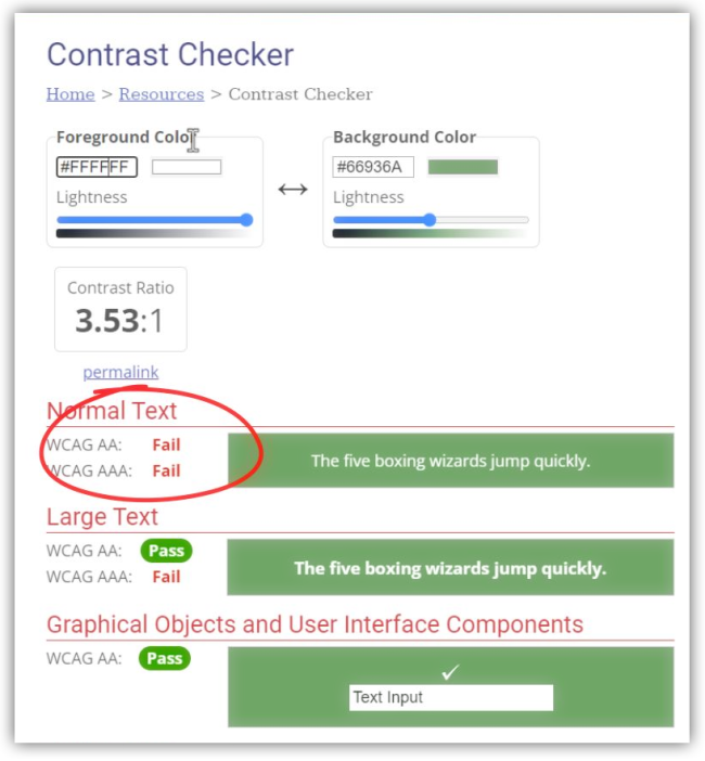
Accessibility standards for color contrast
Nearly all buttons have some kind of text or icon that serves as a label. Be sure there is adequate contrast between the two colors. You can easily test each new button color that you introduce to your design. The image below uses a color contrast checker found on the website of Web Accessibility in Mind, webaim.org.