 Chuck Lorenz
On This Page
Adapt gives you the option of adding text labels to your navigation buttons. You have flexible options for their positions. And you can display them for some device widths and hide them for others.
Configuring labels in the Adapt framework
The ability to add labels to navigation buttons was introduced in adapt-contrib-core v6.34.0 released on 2023-05-02. This generally corresponds to framework version 5.30.3. So you'll want to begin by verifying that you are using these versions or more recent versions. (Reference "How do I find my version number?")
The defaults for the properties of the navigation bar can be manipulated in the course/en/course.json file. To control the default properties, add the following JSON:
"_navigation": {
    "_showLabel": false,
    "_showLabelAtWidth": "medium",
    "_labelPosition": "auto"
}
(Where you place it in the file is not important. Just be sure to separate it from other config objects using commas—and don't paste it in the middle of another object's properties!)
_showLabel
To display labels, change "_showLabel": false to "_showLabel": true .
_showLabelAtWidth
Sometimes you'll want to display the labels when there is ample room such as on desktop, but not when screen real estate is at a premium such as on a mobile phone. Change the value of "_showLabelAtWidth" to control when the labels are displayed. The default value is "medium".
| Value | Effect |
|---|---|
| "any" | Show the label all the time, regardless of the breakpoint. |
| "small" | Show the label at the small breakpoint and above, e.g. mobile phones and larger. |
| "medium" | Show the label at the medium breakpoint and above, e.g. tablets and larger. |
| "large" | Show the label at the large breakpoint and above, e.g. desktop computers. |
_labelPosition
You can control the position of the label in relation to the icon using the "_labelPosition" property. The default value is "auto".
| Value | Effect |
|---|---|
| "auto" | Respecting the locale's language directionality, the labels are automatically positioned to follow the icon. To the right of the icon for languages that are LTR, and to the left of the icon for languages the are RTL. |
| "top" | Positions the label above the icon.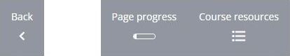 |
| "bottom" | Positions the label below the icon. |
| "left" | Positions the label to the left of the icon, regardless of LTR/RTL directionality.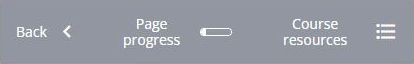 |
| "right" | Positions the label to the right of the icon, regardless of LTR/RTL directionality. |
Where does the label content come from?
The label uses the aria-label text by default. The core navigation button aria-labels can be found in _globals._accessibility in the course/en/course.json file. But you may need to add the text of aria-labels for some plugins. Look for clues and guidance in the example.json and the properties.schema that are part of the plugin's code.
Why add labels to icon buttons?
Icons are intended to communicate while occupying minimal space. When successful, the icon has a specific meaning and is understood by the targeted users. The obvious examples are icons used for Home and Search.
While the Home icon doesn't reflect the look of many homes around the world, and while few persons use a magnifying glass to search for lost items, both symbols have developed specific meanings that transcend languages and cultures. The Home icon takes you to the landing page, the initial start page. And the Search icon triggers a function that allows you filter and select content. With these meanings so well established, a real estate website will confuse its visitors if it uses a house icon to represent properties for sale. The meaning of some icons are so well established that they cannot be used to represent anything else.
The meanings of some other icons are not as firm. The use of the icon may be evolving. And the public's familiarity with its use may be increasing. But many icons and their meanings remain ambiguous.
A classic example of an ambiguous meaning is the floppy disk icon. It depicts a physical object that is no longer in use. An increasing portion of the public does not understand what it depicts. And, as developing technology abandoned floppy disks, the meaning of this icon has lost a single meaning. Can it mean "save to hard drive", "save to cloud", "download to device", "download to device and then open"?
Unfortunately (or fortunately!) the English word "Save" is more precise than the historical icon. Precision decreases the cognitive load of the user. Ambiguous icons increases cognitive load and negatively impacts the user experience.
Adding labels to icon buttons is a balancing act. Usability, available space, translation/localization technology, and consistent design are some aspects that impact that balance. Major platform design systems recommend them, or at least acknowledge them as options.
Labels versus tooltips
Tooltips are another strategy for addressing the ambiguity or imprecision of some icons. A tooltip is a hidden label that a user can trigger to appear, typically by hovering over the button or other element. While the navigation button labels are always visible when enabled, tooltips are transitory—they appear only when the user's mouse is in the vicinity and then disappear again when the mouse is withdrawn. They are not normally available on touchscreens.
Like the use of labels, choosing to use tooltips is a balancing act. Here's a good article to help inform your decision: https://www.nngroup.com/articles/tooltip-guidelines/ I'm sure you'll find more by searching the web and by consulting with colleagues.
Adapt introduced tooltip functionality with the release of adapt-contrib-core version 6.33.0 (2023-04-28). This roughly corresponds to framework version 5.30.1. Individual plugins must be coded to take advantage of the tooltip API. You can find an example of this in adapt-contrib-hotgraphic version 6.7.0 (2023-05-11) and later.